Solar Power Comes to Math Class
“Before you go, I have to show you some really cool graphs!” Judy exclaimed.
It was summer vacation and I was visiting friends in Ithaca, New York. I wasn’t really in the mood to wear my math teacher hat, but Judy pulled me toward her computer and opened the user interface to her solar panels. I was unexpectedly captivated by how much personality the graphs had — every day was different!
Besides the daily power yield views, which reveal sunrise, sunset, capacity, and the passing of each cloud, Judy could follow monthly patterns and see how solar production compared to the predictions upon which her array had been selected. She shared a link with me so that I could take screenshots to make materials for my 7th graders.
As I distributed the materials to my students a few months later, I told them the story of Judy’s solar panels on upstate New York’s first community-based multi-customer solar farm. Remote net metering allows people to invest in grid-connected solar panels (or other renewables) on another piece of property and offset their own energy consumption with those panels. One benefit of the program is that it allows people whose property does not have good sun exposure to find a property that does. Individuals anywhere have the option of installing solar panels “off-the-grid,” but to have solar panels that contribute energy to the grid when they’re producing more than you need, and to be able to use energy from the grid when your solar panels are not producing enough energy to meet your needs, the government has to allow net metering. That happened in New York when a broad coalition came together to figure out the logistics and advocate for change. Net metering laws in New York were expanded in 2011 and then in 2015 the New York Public Service Commission issued an order on shared renewables that made it possible to implement projects like the one Judy was part of. Identifying ideal properties and connecting landowners with the local utility and solar installers was the next step. Local energy activists (including Judy) did a lot of legwork to make that happen. By 2016, their community solar farm in Ithaca was producing energy for 63 households.
A few years ago I attended a Rethinking Schools writing retreat on climate change curriculum. I left determined to write math curriculum that highlighted good news stories about systemic change — stories that show the viability of moving decisively away from a fossil fuels-based economy. Climate change is scary and fear can be paralyzing. To move into a place of action we need to believe that change is possible. It is important that my students understand that solutions already exist and, rather than that we are waiting for someone to invent a solution, the next step is garnering the sociopolitical willpower to invest in, and implement, systemic change.
Although there are lots of hopeful stories out there, it turns out that it’s actually pretty tough to find good stories that are numbers-based, particularly if we home in on numbers that middle school students and average adults can make sense of. My expertise lies in middle school, math pedagogy, and connecting students to place and community. I don’t spend hours of every week following developments in the renewable energy sector, so I turned to my community. For a few years I asked everyone I encountered who seemed remotely interested in sustainability for their good news stories about systemic changes that were shifting communities’ and corporations’ greenhouse gas emission habits and for ideas about where to find relevant data that might connect with students. Judy had already told me about the solar farm and now she was excited to be able to offer me some real data.
The first graphs I shared with my students look at the actual yield versus the expected yield of Judy’s solar panels. I told them, “We’re going to look at some data about Judy’s solar panels today to see if they work as well as she was hoping they would and explore what impact they have had on the environment.
“The vertical axis of these graphs measures kWh or kilowatt hours. A kilowatt hour is a unit of energy that describes how much energy would be consumed by using an average of 1,000 watts per hour. A 100-watt heater, for example, only uses 100 watts per hour so it could run for 10 hours on a kilowatt hour of energy. Please take a few minutes to look at the graphs and see if you can figure out when Judy’s solar panels went online. Record your thinking about how winter production compares to summer production and how that compares to what you would expect. Then write down the questions these graphs make you want to know more about.”
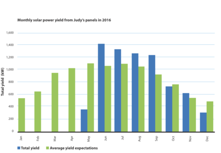
It took my students a little while to make sense of the key and the graph structure, but soon I started to hear voices sharing insights with other students at their tables. “The green is what they thought would happen. The blue is what really happened. See how the blue is missing for a while? Look for where it starts . . .” They decided that the panels probably went online in late May, since the bar representing total yield didn’t start appearing until that month and the yield bar is pretty low.
“What did you discover?” I asked. “How do summer and winter production compare?”
Sammi: “More energy gets produced in summer than in winter.”
“That’s useful because we use more energy in the summer than we do in the winter. Any ideas as to why?” I asked.
Max: “Air conditioning?”
“You’ve got it,” I nodded.
Talia: “Also, in the summer they produced more energy than they expected to and in the winter they produced a little less than they expected to.”
“Interesting. I wonder why that is . . .”
Rehana: “They produced more energy over the course of the year than they expected to.”
“True. And Ithaca is a pretty cloudy place — so that bodes well for solar panels almost everywhere else. Did you expect solar panels to produce more energy in the summer than in the winter?” I asked.
The room filled with a resounding “Yes!”
“Why?” I asked.
Sharif: “Because it’s hotter.”
Me: “It is hotter in the summer, but solar panels don’t use heat to produce energy. I mean, they wouldn’t work in the tropics at night — and summer nights in the tropics are plenty warm.”
Ian: “It’s not about the temperature, it’s about the sunlight. Days are longer in the summer than they are in the winter.”
Rebecca: “And the sun is higher in the sky so the rays hit the panels more directly.”
Me: “Right. What other questions did these graphs make you wonder about?”
They wondered:
- “Why didn’t your friends get solar panels before May 2016?”
- “How did they come up with the average yield expectations?”
- “Is it really cloudy in the winter?”
- “When is the estimated time for the world to become solar powered?”
Some of these are questions I could easily answer. Ithaca experiences particularly gray winters and is in a part of the state that gets significant quantities of snow. My friends invested in solar panels as soon as the laws made it possible for them to connect to the grid, making it financially viable. The estimated time for the world to become solar powered? I love the optimism in this question and let them know that, while I cannot foresee the future, I do believe that we can play a role in shaping it.
The solar farm in Ithaca is located near a coal-fired power plant, which produces energy (along with carbon dioxide and other dangerous pollutants) for much of the region. By averaging data from governments around the world, the crew behind carbonify.com determined that each kilowatt hour of energy produced by a coal-fired power plant releases about 1.5 pounds of CO2 emissions. Carbon dioxide is the most prevalent greenhouse gas, and reducing CO2 emissions is a high priority. For middle school students (and for most of us) carbon dioxide is an abstract concept. You can’t see it or smell it, yet it’s changing the world forever. I know that my students have learned about CO2 in science class and have read the screen on the inverter in the basement of the school farm that tells how many pounds of CO2 have been saved since the solar panels in the fields were installed in 2009. I take time to reiterate what carbon dioxide is and how it is impacting the planet by crowd-sourcing a review of their understanding.
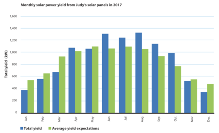
To dig a little deeper into the impact of Judy’s panels, I asked my students to estimate how much energy they produced in 2017 and how much CO2 they avoided putting into the atmosphere. As a result of this study, I hoped students would see the feasibility of solar alternatives — that we can move quickly away from fossil fuel dependency if people organize to make it happen.
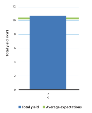
Judy’s system is an average-sized household system with a 9-kilowatt power capacity rating. In the same year that her system went online, Renovus, the company that installed her panels, installed community-distributed solar systems rated a total of 3 megawatts of power, supplying energy to about 330 households. I asked my students to use proportional reasoning and scale up Judy’s panels’ emissions savings to determine the full impact of Renovus’ work that year. Shayna shared, “I’d estimate they saved 2,600 tons of CO2 each year from what they can install in one year! Over the 30-year life of the solar panels, that’s almost 80,000 tons saved!” We turned to the EPA’s greenhouse gas equivalency calculator (found at www.epa.gov/energy/greenhouse-gas-equivalencies-calculator) to get a point of comparison and learn that 2,600 tons of CO2 is equivalent to the average greenhouse gas emissions of driving 550 cars for a year.
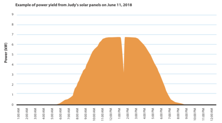
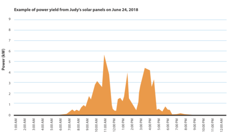
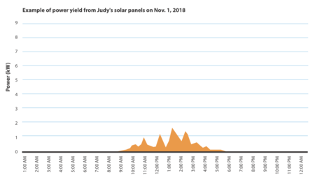
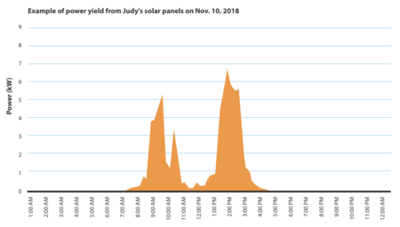
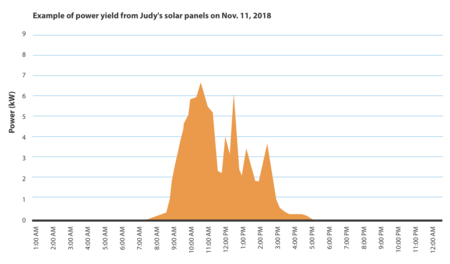
We zoomed in on Judy’s data and looked at 12 graphs, one for each month, showing the energy produced on each individual day. Here are two of them:
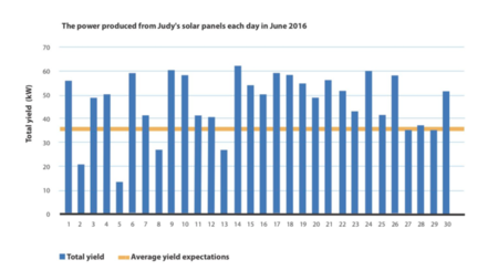
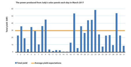
I asked my students to look for what new information is revealed and what new questions surface as we see the solar power generation one day at a time rather than as a monthly average. Among their questions and observations:
- “In August it’s almost never below the average expected yield, but in the winter there are some days when power production is almost zero. Why is that?”
- “Every day there is a different amount of energy being produced. February is a very inconsistent month. In August, the weather is a little more constant. It is a little confusing to compare because the scales are different.”
- “Why aren’t all of the axes the same?”
This lesson falls in the middle of a unit on graph interpretation that will lead into our study of linear relationships. These graphs have been generated by a computer programmed to adjust the y-axes based on the available data. When you look at one month at a time, they read well, but when it’s time to compare them, as I had my students do, the shift in maximum value can play tricks on the viewer. I appreciate that my students have learned to notice the scales on the axes and are thinking about the decisions that graph makers make and how they impact the reader. Their questions and observations represent both mathematical thinking as well as curiosity about the world. Some of their questions led me to share what it means to be grid-connected, how the grid is designed to support peak energy demand, and the way that solar is ideally suited to offset peak demand and, at the very least, eliminate the need to expand our fossil fuel-powered infrastructure.
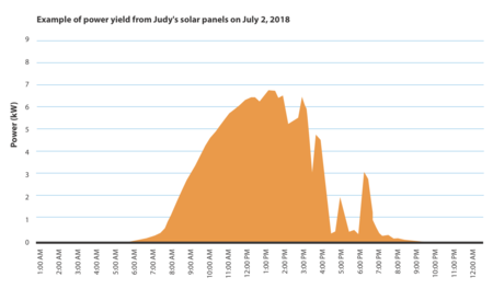
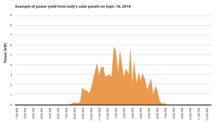
For homework, I had students look at seven graphs from a single week (like the ones pictured at the very beginning of this article) and answer the following prompts:
- Identify at least two commonalities shared by the graphs and explain why they might share those characteristics.
- Beneath each graph, note at least two elements of interest that set it apart from the other graphs on this page. What might have been happening each day to explain why the graph looks the way it does?
Here are some of the observations my students wrote in response:
- “The sun rises and sets every day and there’s no energy when the sun’s not out.”
- “It is pretty common that around the middle of the day it has the most sunlight. Morning is when the energy increases and evening is when the energy decreases. On Sunday there is a point where the sunlight drops completely and that happens because it must have been really cloudy. On Tuesday it goes up and reaches maximum energy until the sun starts setting.”
- “I think that all the plummets are because of passing clouds so on some days there is not a cloud in the sky. I think that how much it drops is due to the clouds’ density and how long it drops for is how long the cloud is blocking the sun.”
An overarching goal I have for my students is for them to practice justifying their reasoning. More of them engage in that instinctively with these graphs than they have with math textbook materials. Like the graphs readily available in textbooks, the solar graphs we’ve just worked with allowed us to connect the graphs to stories and to explore scale, constancy, increase, and decrease. These graphs complement time/distance graphs we’ve been studying of fictional characters’ trips to the store where they walk, run, and rest. Unlike the graphs readily available in textbooks, the solar graphs we’ve just explored allowed us to deepen our understanding of solar energy production, learn how effective it is in New York, and engage with the very real potential for a change in how our energy is produced.
As a math teacher, I tell all sorts of stories to set up math problems in my classroom. But this story, of a small group of people working together to start a project with a scalable impact, made possible by change at the statewide level that came from years of activism, is more important than most. It is just one of many true and hopeful stories out there. And my students need to hear more of these.